Tutorial “Summer in the Valley” by John O’Keefe Jr.

Summer in the Valley by John O'Keefe Jr.

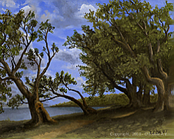
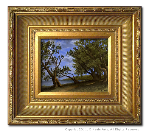
This is my 17th oil painting. I like the effect in my painting “Just Passing Through,” where the path leads the viewer out of the painting and into the mysterious darkness of the forest, and I want to achieve a similar sense of mystery in this painting. I hope you enjoy this tutorial “Summer in the Valley” by John O’Keefe Jr.

Composition and Materials – “Summer in the Valley”

Painting tutorial for 'Summer on the Valley' by John O'Keefe - reference painting 'The White Mountains' by John Kensett
“The White Mountains” by John Kensett

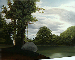
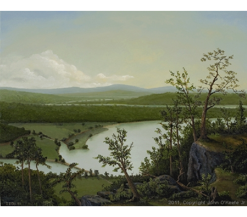
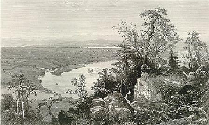
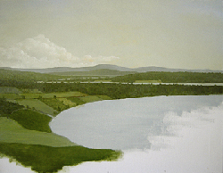
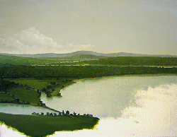
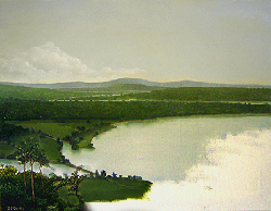
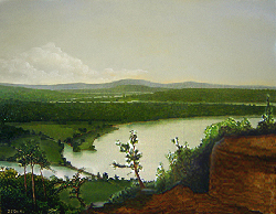
I love “The White Mountains – Mount Washington” by John F. Kensett. I have been attempting to incorporate his color pallet into my recent study paintings. Also, one night when I was looking through some art books, I came across another painting that caught my attention: A landscape painting with a similar composition to Kensett’s painting but with a different approach to color use. The latter painting is entitled “July Fields” by Barbara Nuss, published in the book “14 Formulas for Painting Fabulous Landscapes” by Barbara Nuss.

Painting tutorial for 'Summer on the Valley' by John O'Keefe - reference painting 'July Fields' by Barbara Nuss
“July Fields” by Barbara Nuss

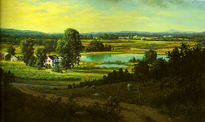
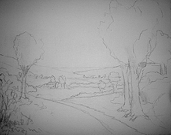
Both of the above landscape paintings are beautiful and have inspired me to try some new things in this painting. I began by sketching the composition onto the canvas. You can see similar elements in my composition from the two reference paintings.

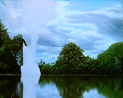
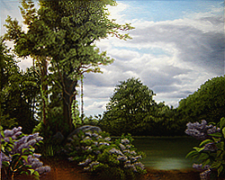
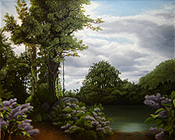
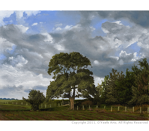
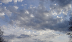
I wanted a vast sky with a lot of blue peeking through thick but bright-tipped clouds. To help achieve this, I have placed several large trees that extend above the horizon, and I want them to stand out against the sky with sharp contrast. My wife Jennifer took the perfect sky picture for this painting which I digitally edited into my reference sketch.

Painting tutorial for 'Summer on the Valley' by John O'Keefe - Reference composition sketch
Composition sketch by John O’Keefe Jr.
Painting tutorial for 'Summer on the Valley' by John O'Keefe - reference composition sketch with cloud photo overlay by Jennifer O'Keefe
Cloud photograph by Jennifer O’Keefe
(Digitally overlaid onto sketch)
  • Support: Pre-Stretched & Mounted Medium Textured Cotton Canvas (Acrylic Primed)
  • Size: 8 x 10 inch
  • Medium: Winsor & Newton Artist Oils Professional Grade Oil Paints
    (Ivory Black, Titanium White, Corelian Blue, Sap Green, Naples Yellow, Raw Sienna, and Raw Umber)
  • Finish: Winsor & Newton Dammar varnish.

Step-By-Step Tutorial – “Summer in the Valley”

Day 1 / Hour 3

Summer on the Valley - Day 1 Hour 3

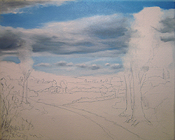
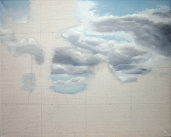
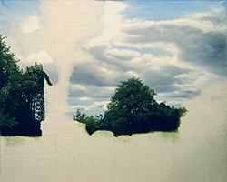
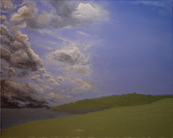
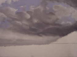
I always begin my paintings by laying down the sky. I blocked in the blue and clouds in this first image rather roughly.


Day 1 / Hour 6

Summer on the Valley - Day 1 hour 6

At this point, I returned to the painting to adjust the sky. I refined the clouds, making them more detailed and distinct by adding darker areas to their underside.


Day 2 / Hour 9

Summer on the Valley - Day 2 Hour 9

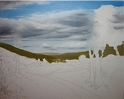
I added white highlights to the clouds, finishing them off. Next, I started with the horizon and distant land features. Notice that I did not paint where my big trees were going.


Day 2 / Hour 12

Summer on the Valley - Day 2 hour 12

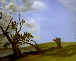
I focused on just midlands and fields, again painting around the areas reserved for my big trees and closeup details. On the left side, I painted foliage right down to the house; I will change this in future sessions.


Day 3 / Hour 15

Summer on the Valley - Day 3 Hour 15

Big day! First, I expanded the field directly in front of the house, opening that area more. The house does not feel so hidden behind the trees and shrubs anymore. Also, the road now follows an “S” shape from the foreground to the house. Next, I began to lay down some of the foreground details. The fields and road are detailed, and I added the big trees on the right and left. I slightly adjusted the original composition to the tree arrangement on the right and added a thick bushy tree to the far right that appears slightly in front of the two taller trees reaching the sky.


Day 3 / Hour 16

Summer on the Valley - Day 3 Hour 16

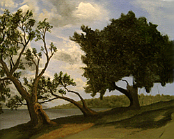
Today I focused on the group of trees to the right. I added the leaves to the two taller trees while also painting the light patterns on the tree trunks. I added highlights to the bushy tree on the far right, and the road received detail.
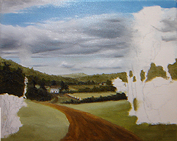

Day 3 / Hour 17

Summer on the Valley - Day 3 Hour 17

Composition Change! I decided to add a huge, close tree on the right with branches that extended out and overhung the left side of the painting. Notice that, at this point, I only painted the trunk itself. I did begin to paint in the shadows from all these trees on the right side, noticing the ground underneath the trees.


Day 4 / Hour 18

Summer on the Valley - Day 4 Hour 18

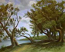
Today came more work on the new big tree. Trunk highlights were added to reflect sunlight. The sun’s position in this painting is directly overhead, so the shadows are cast straight down. I added more green color to the field and toned down the road and shadows on the left.


Day 4 / Hour 20

Summer on the Valley - Day 4 Hour 20

The road needed more earthy tones added, and I started the shadows to the big tree on the right. The effect I was after is when the sun breaks through the tree leaves, making a patchwork of light and shadow on the ground. Leaves were added to the big tree. Because the big tree is so close to the viewer, I took more time to paint the leave in detail. I tried to capture the shape of the leaves rather than adding small dabs of paint as I did on the trees farther away.


Day 4 / Hour 22

Summer on the Valley - Day 4 Hour 22

The field on the left side had too much shadow for the trees in that area, so I brought the sun across the field and off the canvas to the left. I also extend the patchwork of sun and shadow from the big tree across the bottom of the painting. Notice that I also darkened the shadow of the big tree, making more contrast while shading the leaves on the underside of the tree. A small detail was the tire (or wagon) tracks on the dirt road.


Day 5 / Hour 23

Summer on the Valley - Day 5 Hour 23

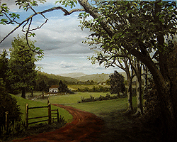
I added some details to the front left of the painting, A shrub, fence, and small flowers. I also kept manipulating the big tree’s patchy light and shadow area. The field in front of the house also received a bit more green.
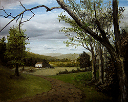

Day 5 / Hour 24

Summer on the Valley - Day 5 Hour 24

The composition (concerning the big tree) led the view off the canvas with the branch on the upper left. Adding some leaves to this bare branch broke up the area helping to keep the viewer’s eye from being led off the canvas. Highlights were added to the dirt road, contrasting light and shadow under the big tree.
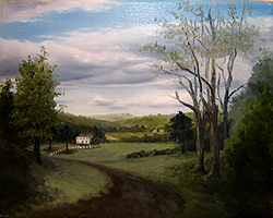
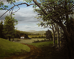

Day 6 / Hour 26

Summer on the Valley - Day 6 Hour 26

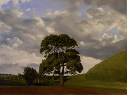
I roughed up the fields to add some texture, giving more of a sense of grasses and weeds and not just a solid block of green. I add the final highlights to the road and shadow under the big tree to finish the painting.

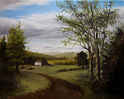
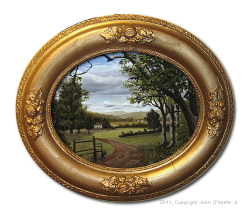
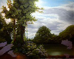
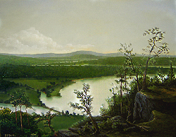
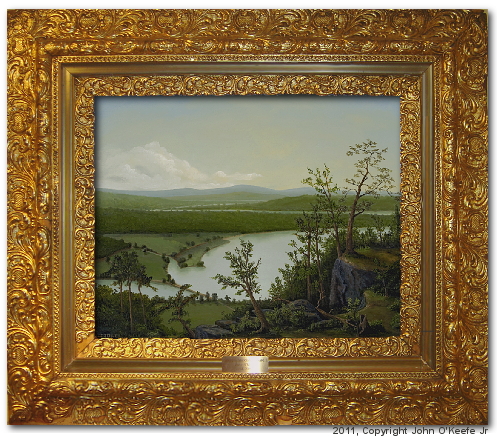
Finished Painting – “Summer in the Valley”

I hope you enjoyed my tutorial “Summer in the Valley” by John O’Keefe Jr.

Tutorial “Lilac Pond” by John O’Keefe Jr.

This is my 14th painting. Please enjoy my tutorial “Lilac Pond” by John O’Keefe Jr.

Composition and Materials – “Lilac Pond”

Painting tutorial for 'Lilac Pond' by John O'Keefe - Reference material, clouds by Jennifer O'Keefe

Jennifer and I took a road trip to capture some beautiful park scenes in the Wallingford area. We took this picture near our home at one of the town’s protected areas in the Open Space Project. This was the perfect backdrop for the next painting.

Painting tutorial for 'Lilac Pond' by John O'Keefe - Reference Victorian engraving overlaid with cloud photo

I wanted a large tree off to one side of the painting, a common element in many Hudson River School paintings. Not satisfied with any of the photographed trees from our road trip, I turned to the Internet for reference material. While searching, I came across a beautiful set of trees in an old Victorian engraving. Using digital image editing software (Adobe Photodeluxe), I removed unwanted areas from the engraving image and merged the two images into this composite.

  • Support: Stretched Fine Linen (Oil Primed)
  • Size: 16 x 20 inch
  • Medium: Winsor & Newton Artist Oils Professional Grade Oil Paints
    (Ivory Black, Titanium White, Corelian Blue, Sap Green, Naples Yellow, Raw Sienna, Burnt Sienna, and Vandyke Brown)
  • Finish: Winsor & Newton Dammar varnish

Step-By-Step Tutorial – “Lilac Pond”

Days 1-3

Lilac Pond by John O'Keefe - Day 3

I drew a pencil grid pattern onto my canvas that matched a corresponding grid on my reference photo. Thus, I could reasonably position elements from the photograph to the painting. You can make out the reference lines in the image. As always, I started painting the farthest objects in the scene, the clouds.


Days 4 & 5

Lilac Pond by John O'Keefe - Day 5

I had started to lay out the mid-line trees. At this point, I realized I was displeased with the original composition. I wanted to keep the big trees from the engraving but not the others.


Day 6

Lilac Pond by John O'Keefe - Day 6

I finished laying out the mid-line trees. I was still unable to decide what to put on the right side of the painting. My idea of a field and farmhouse did not feel right anymore. Now I wanted water, a pond in place of the field. I also thought of adding birds, a tight closeup of Hummingbirds sitting on a branch and admiring the area they call home.


Day 6 (Digital Edits)

Lilac Pond by John O'Keefe - Day 6 composition edits

Using Adobe Photodeluxe, I worked out my new ideas on the computer and produced this new digital composition. You can see that I cut back more of the engraving features from the right side, exposing the pond. The two Hummingbirds would look well placed to the right.


Day 7

Lilac Pond by John O'Keefe - Day 7

Now came the big trees on the left. I blocked in the large boulder and dirt ground. I was not entirely pleased with my pond because it did not have the glassy surface feel I achieved in the digital composition. However, I was content enough to move on.


Day 8

Lilac Pond by John O'Keefe - Day 8

It had been about three weeks since I had last worked on the painting, and I again decided to make composition changes. This time I wanted Lilac bushes in the foreground and not the birds. I searched the Internet for photographs of Lilac bushes that fit nicely into my painting. In this snapshot, I completed painting the shrubs in the middle and started blocking in the purples that will become the remaining Lilac bushes on either side.


Day 9

Lilac Pond by John O'Keefe - Day 9

More detail was added to the Lilac bushes on the left and right sides. I also added more highlights to the Lilacs in the middle.


Day 10

Lilac Pond by John O'Keefe - Day 10

Just about done. I added the leaves to the Lilac bushes. I took great care to get the shadows right, but my wife said something interesting. She thought the light green trees on the right side (behind the row of trees along the pond shore) were a tree overhanging the pond and not distant hills as I intended.


Day 11

Lilac Pond by John O'Keefe - Day 11

I decided that a few minor touch-ups would be good. I agreed with her assessment, removed the light green line along the far pond shore, and increased the contrast between the mid-line trees and the distant hill on the far right.

Finished Painting – “Lilac Pond”

I hope you enjoyed my tutorial “Lilac Pond” by John O’Keefe Jr.

Tutorial “River Through the Adirondacks” by John O’Keefe Jr.

River Through the Adirondacks by John O'Keefe Jr.

This is my 12th oil painting. While the actual time to complete this painting was about 12 days, those 12 days were spread out over two months. I used a combination of wet-into-wet and wet-into-dry techniques. I did not use any added mediums in the paint or artificial dryers: the paint came straight out of the tubes. Please enjoy my tutorial “River Through the Adirondacks” by John O’Keefe Jr.

Composition and Materials – “River Through the Adirondacks”

Painting tutorial for 'River Through the Adirondack's' by John O'Keefe - Reference Victorian engraving

I was aiming for a Hudson River School feel with this painting. I found an old black and white Victorian engraving I liked online and decided to base my painting on its features. Furthermore, I do not know the scene’s location in this engraving, but I assume it is a real place. Because the engraving reminded me of the Hudson Valley, I named my painting “River Through the Adirondacks.”

My final painting differs from this reference material in the details. I had cropped the far-right portion of the engraving out of my painting, but the larger aspects of the composition can still be seen in my finished work.

  • Support: Pre-Stretched & Mounted Medium Textured Cotton Canvas (Acrylic Primed)
  • Size: 16 x 20 inch
  • Medium: Winsor & Newton Artist Oils Professional Grade Oil Paints
    (Ivory Black, Titanium White, Ultramarine Blue, Sap Green, Naples Yellow, Raw Sienna, and Burnt Sienna)
  • Finish: Winsor & Newton Dammar varnish

Step-By-Step Tutorial – “River Through the Adirondacks”

Day 1

River Through the Adirondacks - Day 1

Painting begins by completing the sky with significant land and water areas blocked-in. In the foreground (unpainted white areas) will be the close-up details of the trees, foliage, and rocks. Before painting those details, I must finish the distant scenery and waterways.


Day 2

River Through the Adirondacks - Day 2

I have added more definitions to the low-land areas. The fields are more defined now.


Day 3

River Through the Adirondacks - Day 3

Here is an update on the distant land features: You can see that I tightened things up a bit and added increased detail and contrast to the forests and distant hills of the low-land areas.


Day 4a

River Through the Adirondacks - Day 4

I thought the painting from Day 3 had too much of an agricultural feeling, and I wanted something more natural and park-like. Compare the middle-left areas between Day 3 and Day 4 images to see the new direction in which I took the painting. I also began to add shoreline shadows and reflections. (One nice feature about working with oils is the slow dry time, you can scrape off entire areas and redo them without anyone ever knowing unless you tell them!)


Day 4b

River Through the Adirondacks - Day 5

I finished Day 4 by updating the tree shadows and the little island feature at the river’s bend. I also updated the last shadows and reflections along the shoreline.


Day 5 & 6

River Through the Adirondacks - Day 6

I let the painting dry for about three weeks before starting this phase. Now I was ready to add the details and the foreground. I began by blocking the tree line and mountain features. I used the reference picture strictly at this point.


Day 7

River Through the Adirondacks - Day 7

Once happy with the tree line, I laid out the rock formations: several large boulders in the middle and a large cliff face to the right.


Day 8
River Through the Adirondacks - Day 8

At this point, I continued to try to match the reference engraving image for the foreground details. You can see shrubs covering the boulders and several tall tree trunks coming up from around the cliff.


Day 9

River Through the Adirondacks - Day 9

This one is challenging. Many trees are in the foreground, and the proper contrast proved difficult. I redid the foliage in the front-center rock cropping near the bottom, and more is coming. (i.e., a Large rock on the right and a large tree that you can make out the trunk on top of the rocks, plants, and smaller greens in the lower right corner.)

I’ll probably go over the entire painting with a detail brush to add in the final highlights and deep shadows. I’m thinking of adding some blue flowers in the foreground to the right and more browns into the closer trees and bushes for more color variation.


Day 10

River Through the Adirondacks - Day 10

Again I broke from the reference material and decided to make the foreground-right less rocky. Notice the flat areas to the right are covered with short grass. This would be a perfect place for people to visit and walk around. I think it’s more inviting than the wilderness of the original reference image.


Day 11

River Through the Adirondacks - Day 11

I have extended the flat grassy area to the middle section. I brought the center tree into the foreground rather than having it come up from behind the rock cropping. Now you could walk right up to it and lean on it while viewing it. Also, I added the large tree on the top rock cropping.

You can walk up to this spot to see the sights. I started adding the shadows that were being cast by the larger trees. I wanted to give the viewer a sense that the sun was off in the direction of those distant clouds, perhaps just off the canvas in the upper-right corner.


Day 12

River Through the Adirondacks - Day 12

Now comes all the small shrubs, trees, and other foliage. I went over the foreground to bring out highlights. Notice the tree trunk still in the ground next to the fallen tree. Although it’s hard to see, I ensured the lighting and shadows coming off the trees in the lowlands were consistent with the shadows I added to the foreground.

Finished Painting – “River Through the Adirondacks”

River Through the Adirondacks by John O'Keefe Jr., Framed

I hope you enjoyed my tutorial “River Through the Adirondacks” by John O’Keefe Jr.

Tutorial “Old Olive Tree Path” by John O’Keefe Jr.

Old Olive Tree Path by John O'Keefe Jr.

This was my 11th painting. This painting was a direct study of an old Victorian engraving. It had been several weeks since I last painted, and I wanted a miniature warm-up painting. Trees have been a little difficult for me until now, so I decided this study would be about trees. Please enjoy my tutorial “Old Olive Tree Path” by John O’Keefe Jr.

Composition and Materials – “Old Olive Tree Path”

Old Olive Tree Path, Victorian engraving

When I came across the Victorian engraving below, I knew it was the scene I wanted to paint. I researched the Internet for color photographs of olive trees for a good color reference. The clouds I used are from a photograph that Jennifer had taken one afternoon in our neighborhood. The painting is relatively small at 8 x 10 inches.

  • Support: Pre-Stretched & Mounted Medium Textured Cotton Canvas (Acrylic Primed)
  • Size: 8 x 10 inch
  • Medium: Winsor & Newton Artist Oils Professional Grade Oil Paints
    (Ivory Black, Titanium White, French Ultramarine Blue, Sap Green, Raw Sienna, and Burnt Sienna)
  • Finish: Winsor & Newton Dammar varnish.

Step-By-Step Tutorial – “Old Olive Tree Path”

Day 1

Old Olive Tree Path - Day 1

I always begin a landscape painting with the sky. I knew a large group of trees would be on the right side of this scene, so as you can notice, I did not paint any clouds in that area; only the blue sky is visible on the right. After the sky and clouds looked complete, I blocked in the foreground the large body of water and the remote peninsula.


Day 2

Old Olive Tree Path - Day 2

Once satisfied with the background elements of the painting, I started adding the trees and shadows.


Day 3

Old Olive Tree Path - Day 3

Now I’m focused on painting the trees. I was attempting to follow the engraving as closely as possible. The Victorian engraving was perfect for the Hudson River School style of painting that I’m trying to develop.


Day 4

Old Olive Tree Path - Day 4

The distant tree on the right was painted darker so there would be a noticeable contrast between it and the closest tree. I think the effect was working nicely at this point.


Day 5 (Digital Edits)

Old Olive Tree Path - Day 5 digital edits

Using my computer, I created this digital update. Seeing minor changes on the computer is faster and less risky than updating the actual painting. The distant shoreline is more defined, the horizontal plane of the coastline now carries out into the ocean, and the forward right tree trunk now has more highlights so that it pops. More sunlight also passes through the tree leaves and branches, making a beautiful array of shadows on the ground.


Day 6

Old Olive Tree Path - Day 6

Day 6 was about implementing the digital edits from the previous day.

Finished Painting – “Old Olive Tree Path”

Old Olive Tree Path by John O'Keefe Jr., Framed
Old Olive Tree Path by John O'Keefe Jr., Displayed

I hope you enjoyed my tutorial “Old Olive Tree Path” by John O’Keefe Jr.

Tutorial “The Field’s Edge” by John O’Keefe Jr.

The Field's Edge by John O'Keefe Jr.

“The Field’s Edge” was a milestone painting for me and my 10th painting. A professional artist once told me I should see a noticeable improvement in my ability after every ten paintings. He must have been right because this painting was the 10th oil painting I ever completed. Another factor that might have been at play was my daughter was seriously ill at the time with a life-threatening blood infection, and I might have been releasing all that stress and anxiety into the painting. Please enjoy this tutorial “The Field’s Edge” by John O’Keefe Jr.

Composition and Materials – “The Field’s Edge”

Painting tutorial for 'The Field's Edge' by John O'Keefe Jr. - reference material - cloud photograph by Jennifer O'Keefe

I’m a big fan of the Hudson River School painters, and because of this, I have been trying to develop similar skills in landscape painting. Also, the clouds in this scene are from my wife’s photograph and a picture from the wetcanvas.com reference library for the field and trees, and these combined to make a good composition for me.

I switched from Winsor & Newton Winton to Winsor & Newton Artist Oil Color and experienced a big difference in colors, mixing, and how the paint goes onto the canvas. Professional-grade oil paints are preferred over student-grade paints. I limited myself to a six-color pallet (see below) and used NO mediums; the paint was straight out of the tubes. The green of choice was Sap Green mixed with Titanium White or Ivory Black. Added to this was a little Raw Umber or Raw Sienna to add some earthy tones. Also, I added the sap green straight onto the canvas in the grass running across the middle of the painting. Of course, it had blended a little as I was painting wet on wet.

I put about 25 hours into this painting spread over five days: about 5 hours daily, including prep and clean up. Also worth mentioning is that I painted sitting under a 60-watt incandescent light bulb with not much natural outside light shining on the canvas as I worked.

  • Support: Pre-Stretched & Mounted Medium Textured Cotton Canvas (Acrylic Primed)
  • Size: 12 x 16 inch
  • Medium: Winsor & Newton Artist Oils Professional Grade Oil Paints
    (Sky/Clouds: Titanium White, Ivory Black, and Ultramarine Blue)
    (Landscape: Titanium White, Ivory Black, Sap Green, Raw Umber, Raw Sienna, Alizarin Crimson, and Napals Yellow)
  • Finish: Winsor & Newton Dammar varnish

Step-By-Step Tutorial – “The Field’s Edge”

Day 1

The Field's Edge - Day 1

I began this painting with the most distant objects: the sky and clouds. These were aggressive clouds that were very busy.


Day 2

The Field's Edge - Day 2

The clouds needed refinement, so I kept working with a blending brush until they flowed smoothly and improved the contrast between light and dark areas. However, at this point, things looked a little stormy.


Day 3

The Field's Edge - Day 3

Notice the final white highlights added to the clouds, removing the dark feel from Day 2. It now looks like a bright sunny day. I also added the ground and the beginning of the tree line, and I intended to have a powerful contrast between light and dark. Notice its effect when comparing the ground objects against the sky.


Day 4

The Field's Edge - Day 4

The big tree is complete, and now it’s time to work on the tree line to the right. I slightly modified each tree’s colors to make the multiple trees stand apart, and I added green to some and brown and red to others. The overall effect is to give a sense of many trees growing together. Adding the right amount of darkness to areas proved more difficult than I initially thought. I continued to make adjustments by increasing darker areas, such as under the trees.


Day 5

The Field's Edge - Day 5

It was a perfect sunny day. The puffy clouds and the darker patches are nothing more than deep shadows. There was not a drop of rain in the sky that day. Furthermore, I have been working on achieving the correct/accurate balance between light and dark areas in my landscape paintings, and it’s incredible how much of both are present even on a very sunny day. When I would sit at the end of the day and review my painting against the reference photo, I noticed how much lighter my painting seemed. I had not put enough contrast between light and dark objects.

The painting became more realistic as I continued to retouch those lighter areas by adding more shadows. Also, I have seen many paintings that do not have enough contrast between objects, and these paintings always seem to be missing something to me; they lose depth and appear flat. For example: Instead of using darker green for shadows under the trees, I saw a more realistic painting emerge when I painted straight black into those areas. I’m learning not to be so afraid of using darks.

Finished Painting“The Field’s Edge”

The Field's Edge by John O'Keefe Jr., Framed
The Field's Edge by John O'Keefe Jr., Displayed

I hope you enjoyed this tutorial “The Field’s Edge” by John O’Keefe Jr.