Tutorial “The Field’s Edge” by John O’Keefe Jr.

The Field's Edge by John O'Keefe Jr.

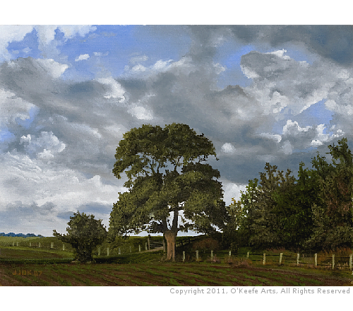
“The Field’s Edge” was a milestone painting for me and my 10th painting. A professional artist once told me I should see a noticeable improvement in my ability after every ten paintings. He must have been right because this painting was the 10th oil painting I ever completed. Another factor that might have been at play was my daughter was seriously ill at the time with a life-threatening blood infection, and I might have been releasing all that stress and anxiety into the painting. Please enjoy this tutorial “The Field’s Edge” by John O’Keefe Jr.

Composition and Materials – “The Field’s Edge”

Painting tutorial for 'The Field's Edge' by John O'Keefe Jr. - reference material - cloud photograph by Jennifer O'Keefe

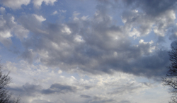
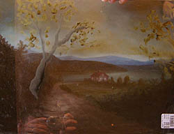
I’m a big fan of the Hudson River School painters, and because of this, I have been trying to develop similar skills in landscape painting. Also, the clouds in this scene are from my wife’s photograph and a picture from the wetcanvas.com reference library for the field and trees, and these combined to make a good composition for me.

I switched from Winsor & Newton Winton to Winsor & Newton Artist Oil Color and experienced a big difference in colors, mixing, and how the paint goes onto the canvas. Professional-grade oil paints are preferred over student-grade paints. I limited myself to a six-color pallet (see below) and used NO mediums; the paint was straight out of the tubes. The green of choice was Sap Green mixed with Titanium White or Ivory Black. Added to this was a little Raw Umber or Raw Sienna to add some earthy tones. Also, I added the sap green straight onto the canvas in the grass running across the middle of the painting. Of course, it had blended a little as I was painting wet on wet.

I put about 25 hours into this painting spread over five days: about 5 hours daily, including prep and clean up. Also worth mentioning is that I painted sitting under a 60-watt incandescent light bulb with not much natural outside light shining on the canvas as I worked.

  • Support: Pre-Stretched & Mounted Medium Textured Cotton Canvas (Acrylic Primed)
  • Size: 12 x 16 inch
  • Medium: Winsor & Newton Artist Oils Professional Grade Oil Paints
    (Sky/Clouds: Titanium White, Ivory Black, and Ultramarine Blue)
    (Landscape: Titanium White, Ivory Black, Sap Green, Raw Umber, Raw Sienna, Alizarin Crimson, and Napals Yellow)
  • Finish: Winsor & Newton Dammar varnish

Step-By-Step Tutorial – “The Field’s Edge”

Day 1

The Field's Edge - Day 1

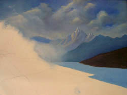
I began this painting with the most distant objects: the sky and clouds. These were aggressive clouds that were very busy.
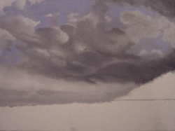

Day 2

The Field's Edge - Day 2

The clouds needed refinement, so I kept working with a blending brush until they flowed smoothly and improved the contrast between light and dark areas. However, at this point, things looked a little stormy.


Day 3

The Field's Edge - Day 3

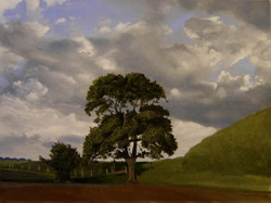
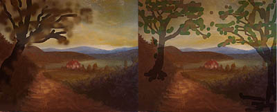
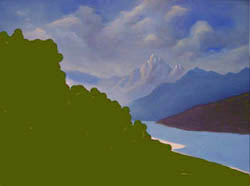
Notice the final white highlights added to the clouds, removing the dark feel from Day 2. It now looks like a bright sunny day. I also added the ground and the beginning of the tree line, and I intended to have a powerful contrast between light and dark. Notice its effect when comparing the ground objects against the sky.


Day 4

The Field's Edge - Day 4

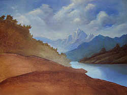
The big tree is complete, and now it’s time to work on the tree line to the right. I slightly modified each tree’s colors to make the multiple trees stand apart, and I added green to some and brown and red to others. The overall effect is to give a sense of many trees growing together. Adding the right amount of darkness to areas proved more difficult than I initially thought. I continued to make adjustments by increasing darker areas, such as under the trees.


Day 5

The Field's Edge - Day 5

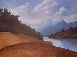
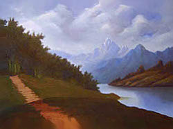
It was a perfect sunny day. The puffy clouds and the darker patches are nothing more than deep shadows. There was not a drop of rain in the sky that day. Furthermore, I have been working on achieving the correct/accurate balance between light and dark areas in my landscape paintings, and it’s incredible how much of both are present even on a very sunny day. When I would sit at the end of the day and review my painting against the reference photo, I noticed how much lighter my painting seemed. I had not put enough contrast between light and dark objects.

The painting became more realistic as I continued to retouch those lighter areas by adding more shadows. Also, I have seen many paintings that do not have enough contrast between objects, and these paintings always seem to be missing something to me; they lose depth and appear flat. For example: Instead of using darker green for shadows under the trees, I saw a more realistic painting emerge when I painted straight black into those areas. I’m learning not to be so afraid of using darks.
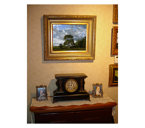
Finished Painting“The Field’s Edge”

The Field's Edge by John O'Keefe Jr., Framed
The Field's Edge by John O'Keefe Jr., Displayed

I hope you enjoyed this tutorial “The Field’s Edge” by John O’Keefe Jr.

Tutorial “Peaceful Connecticut Valley in Autumn” by John O’Keefe Jr.

Peaceful Connecticut Valley in Autumn by John O'Keefe Jr.

This was my fourth oil painting and first original composition. Using pencil and paper, I roughed out this simple sketch. I decided to use a canvas size of 12×16. Before this painting, I would select colors from a large pallet of oil paints in my studio and do a little mixing of colors. However, this painting was my first time using a limited color pallet. Please enjoy my tutorial “Peaceful Connecticut Valley in Autumn” by John O’Keefe Jr.

Composition and Materials – “Peaceful Connecticut Valley in Autumn”

Peaceful Connecticut Valley in Autumn, Composition Sketch
Composition sketch
  • Support: Pre-Stretched & Mounted Medium Textured Cotton Canvas (Acrylic Primed)
  • Size: 12 x 16 inch
  • Medium: Winsor & Newton Winton Student Grade Oil Paints
    (Ultramarine Blue, Viridian, Cadmium Yellow Deep, Titanium White, Raw Umber, Cadmium Red, and Lemon Yellow)
  • Finish: Winsor & Newton Dammar varnish

Step-By-Step Tutorial – “Peaceful Connecticut Valley in Autumn”

(Note: The progress photos are not the best quality concerning accurate color representation. However, the finished painting photos represent the actual colors.)

Day 1

Peaceful Connecticut Valley in Autumn - Day 1

Using a medium-sized brush, I blocked in the sky, distant land features, near land features, and the initial layer of the dirt road.


Day 2

Peaceful Connecticut Valley in Autumn - Day 2

The painting had too many blues, so I changed the sky colors, distant left features, and the field. I blocked in, using raw umber, my hills to the left and right, and added details to the dirt road, such as the wagon tracks. Finally, I began to add lighting and shadows across the field and the road.


Day 3

Peaceful Connecticut Valley in Autumn - Day 3

It was time to add the house and the smaller trees next to it. In front of a large field was the house. To the left and right are small trees and shrubs.


Day 4: Composition Ideas for Adding Trees

I originally intended to add trees to this painting; however, after the trial runs, I was unsure about adding them. The final oil painting does not have trees. One day (If I do not varnish the painting first), I may add trees when I feel more comfortable creating them.

Peaceful Connecticut Valley in Autumn - John's composition ideas 1
Computer experimentation with trees
Peaceful Connecticut Valley in Autumn - John's composition ideas 2
Painted glass overlay with trees.

Day 4: Lighting Adjustments

I changed the field beyond the house to a body of water and added light and shadow along the road, envisioning the sun setting and casting long shadows. I painted the shoreline along the far side to make the water look believable.

However, after looking at this painting for a while, I was not pleased with the lighting along the sides. Using my computer, I played around with various lighting changes. I wanted to get the setting sun reflected in the foreground hills to the left and right. My final concept is with a before (Day 4 painting) / after (Day 4 digital edits) image.

Peaceful Connecticut Valley in Autumn - Day 4 animation
Before/After Animation.

Day 5

Peaceful Connecticut Valley in Autumn - Day 5

The changes from Day 4 are in this final picture.


Finished Painting“Peaceful Connecticut Valley in Autumn”

Peaceful Connecticut Valley in Autumn, Framed
Peaceful Connecticut Valley in Autumn, Desplayed

I hope you enjoyed my tutorial “Peaceful Connecticut Valley in Autumn” by John O’Keefe Jr.

Tutorial “Lakeside Path” by John O’Keefe Jr.

Lakeside Path by John O'Keefe Jr.

This was my third oil painting. I was still uncomfortable with the idea of creating my composition, so I continued to study the works of other artists and test my ability to duplicate their paintings with a reasonable amount of accuracy. This painting was copied from a painting by Eduard Boehm, a 19th-century Austrian artist. I do not know Eduard’s title or the date he painted it. Please enjoy my tutorial “Lakeside Path“ by John O’Keefe Jr.

Composition and Materials – “Lakeside Path”

Lakeside Path by John O'Keefe Jr., Reference painting by Eduard Boehm
Painting by Eduard Boehm
  • Support: Pre-Stretched & Mounted Medium Textured Cotton Canvas (Acrylic Primed)
  • Size: 11 x 14 inch
  • Medium: Winsor & Newton Winton Student Grade Oil Paints
  • Finish: Winsor & Newton Dammar varnish

Step-By-Step – “Lakeside Path”

Day 1

Lakeside Path - Day 1

The clouds came first, followed by a rough outline of the distant mountains.


Day 2

Lakeside Path - Day 2

More refinements to the clouds. Added details to the distant mountains. I blocked the land mass to the right, along with the waterway.


Day 3

Lakeside Path - Day 3

Using my computer, I blocked in the left foreground. I did this to visualize how my next steps would look.


Day 4

Lakeside Path - Day 4

First, I added detail to the right-side landmass and reflections to the waterway. For the under-painting, visible on the left, I used raw umber and blocked in the general landmass features.


Day 5

Lakeside Path - Day 5

Starting with the distant tree line on the left side, I added darker colors to become my shadows. I then added more detail to the landmass on the right.


Day 6

Lakeside Path - Day 6

Again, using the darker colors that would be the basis for my shadows, I began to add more detail to the left-side land areas. The path has also been blocked-in.


Day 7

Lakeside Path - Day 7

I started adding highlights to the distant tree line and land areas, followed by the row of tree trunks.


Day 8

Lakeside Path - Day 8

I started adding light green tones and the grass along the shoreline. Then I blocked in a dead tree trunk and rock to the front left. Also, I highlighted the path.


Day 9

Lakeside Path - Day 9

Lastly, I added all the fine details. I finished the foreground shrubs, path, and rocks.

Finished Painting – “Lakeside Path”

Lakeside Path by John O'Keefe Jr., Framed
Lakeside Path by John O'Keefe Jr., Displayed

I hope you enjoyed my tutorial “Lakeside Path” by John O’Keefe Jr.

Tutorial “Autumn on the Hudson Revisited” by John O’Keefe Jr.

Autumn on the Hudson Revisited by John O'Keefe Jr.

This is my first oil painting. I used a small 6 X 4 Canvas Board with inexpensive oil paints. I did not want to spend much money on my first attempt. This painting is not an original composition of mine; I referenced a portion of a painting by Thomas Doughty. Thomas Doughty was one of the first Hudson River School painters, and the painting is titled “Autumn on the Hudson.” Please enjoy my tutorial “Autumn on the Hudson Revisited” by John O’Keefe Jr.

Composition and Materials – “Autumn on the Hudson Revisited”

Reference painting by Thomas Dought entitled Autumn on the Hudson
Autumn on the Hudson
by Thomas Doughty, 1850
  • Support: Canvas Board (Medium Textured / Acrylic Primed)
  • Size: 6 x 4 inch
  • Medium: Very cheap oil paints – brand unknown
  • Finish: Winsor & Newton Dammar varnish

Step-By-Step – “Autumn on the Hudson Revisited”

Day 1

Autumn on the Hudson Revisited by John O'Keefe Jr. - Day 1

I painted in layers, as you can see in the attached images. First, I painted the background – sky, water, mountains, and field as shown.


Day 2

Autumn on the Hudson Revisited by John O'Keefe Jr. - Day 2

I let the painting dry for several days before adding the distant trees, shrubs, and large tree trunk.


Day 3

Autumn on the Hudson Revisited by John O'Keefe Jr. - Day 3

The leaves on the big tree, the house, and some additional details in the landscape came last. I was not happy with the big tree, but I was too nervous that I would ruin the whole painting if I tried to change it, so I left it alone.

Finished Painting – “Autumn on the Hudson Revisited”

Autumn on the Hudson Revisited by John O'Keefe Jr., Framed
Autumn on the Hudson Revisited by John O'Keefe Jr., Displayed

I hope you enjoyed my tutorial “Autumn on the Hudson Revisited” by John O’Keefe Jr.